Quick summary:
In the age of mobile-first design, your website's navigation is no longer just a desktop issue. Mobile users make up the majority of traffic today, and they are quick to leave when faced with confusing layouts or broken navigation. However, many websites still have serious issues with their mobile navbars that harm the user experience. These are precisely the mobile navbars mistakes that brands must pay attention to.
At Arnology, we focus on creating smooth digital experiences across devices. Over the years, we've noticed the most harmful mobile navbars mistakes that brands often make. Whether you're starting from scratch or updating your UX, here are five common mobile app navigation and mobile navbars mistakes to avoid — and how to address them.
1. Overcrowding the Navbar with Too Many Items
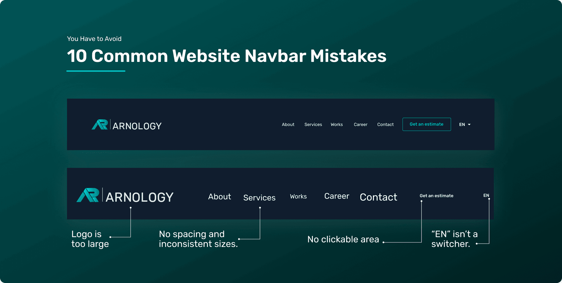
One of the most common mobile navbars mistakes is overcrowding the navbar with links. Unlike desktops, phones have limited space. A crowded navbar overwhelms users and makes it hard to click. These mobile navbars mistakes disrupt user flow, increase bounce rates, and reduce engagement.
Fix it: Prioritize. Stick to four to five essential items. Use expandable menus or a hamburger icon to show more options. If users have to hunt or pinch-zoom just to read the navbar, you're making a fundamental mobile navbars mistake.
2. Using Vague or Unclear Labels
Another frequent mobile navbars mistake is using generic or overly creative labels. "Discover," "Explore," or "More" may sound nice, but they mean nothing to first-time visitors. These unclear choices are classic mobile navbars mistakes that confuse users and slow navigation.
Fix it: Clarity is key. Use standard labels like "Shop," "Contact," or "About Us." The quicker users understand, the faster they convert, lowering the number of mobile navbars mistakes on your site.
3. Hiding Navigation Behind Confusing Icons
Not all visitors know what the hamburger icon (☰) means, especially older users. Relying only on unclear icons is a usability issue and a common mobile navbars mistake in modern design.
Fix it: Add text next to your icons or use an animation to show when a menu is opening. This reduces confusion and improves accessibility, helping you avoid these typical mobile navbars mistakes.
4. Inconsistent Navigation Across Pages
Consistency is essential in UX. If your mobile navbar looks different on various pages or apps, it can confuse users and create mistrust. This is one of the simplest mobile navbars mistakes to fix but one that many still overlook.
Fix it: Ensure that every page has the same menu structure, color scheme, and layout. Avoid changing designs mid-journey, or you risk falling into one of the most avoidable mobile navbars mistakes.
5. Poor Tap Targets and Touch Zones
Using tiny links or buttons is a big mobile navbars mistake. Users tap with their thumbs, not a mouse, and small tap zones can frustrate them. This is a usability nightmare among the most common mobile navbars mistakes.
Fix it: Make sure buttons and links are at least 48x48 pixels in size. Proper spacing is also important. Avoid clusters of navigation items that cause misclicks and create further mobile navbars mistakes.
6. Non-Sticky or Disappearing Navbars
Have you ever scrolled down a mobile site and lost the menu? That's a significant mobile navbars mistake, especially on pages where users want to navigate quickly.
Fix it: Use a sticky mobile navbar that follows users as they scroll. Bonus points for hiding it when scrolling down and showing it again when scrolling up, keeping things tidy while avoiding common mobile navbars mistakes.
7. No Search Function in the Navbar
Mobile users want speed. If your navigation lacks a search bar or buries it at the bottom, you're making one of the most avoidable mobile navbars mistakes.
Fix it: Include a visible search icon in the top-right corner and use autocomplete to improve usability. Ignoring search is a lazy mobile navbars mistake, especially for e-commerce or content-heavy sites.
8. Failing to Optimize for One-Handed Use
Most mobile interactions happen with one hand. If navigation is at the top or edges, it's harder to reach, making this a common mobile navbars mistake in design.
Fix it: Design navbars and key actions to be easy to reach with your thumb. Consider using bottom navigation menus, which are becoming more common to avoid these mobile navbars mistakes.
9. No Visual Feedback or Active States
Users want to know their current location. If menu items don't provide visual feedback when tapped or selected, you create invisible mobile navbars mistakes that leave users uncertain.
Fix it: Highlight active pages with visual cues and touch animations. These indications can lower bounce rates and address a wide range of mobile navbars mistakes.
10. Neglecting Accessibility Standards
This is one of the most serious mobile navbars mistakes, as it can lead to legal problems. If your navigation isn't accessible via screen readers or keyboard input, you exclude entire groups of users.
Fix it: Use proper ARIA roles, semantic HTML (<nav>), good color contrast, and keyboard focus indicators. Make inclusivity part of your mobile design to avoid critical mobile navbars mistakes that harm your reputation.
Bonus: More Mobile Navbars Mistakes to Watch For
There are many potential mobile navbars mistakes. Here are a few more mistakes we often find during audits:
Too many dropdown layers: Users get stuck in nested menus — a frequent mobile navbars mistake.
Slow load times: Heavy menus with many icons or scripts affect performance and lead to mobile navbars mistakes.
No "Back to Top" button: This forces users to scroll indefinitely, another ignored mobile navbars mistake.
Lack of language switcher or region selector: This is especially troublesome for global brands and is a repeated mobile navbars mistake.
Not testing on actual devices: Simulators won't reveal all mobile navbars mistakes that real users experience.
Why Fixing Mobile Navbars Mistakes Matters
These mobile navbars mistakes affect three key areas of digital success:
User retention: Confusing navigation drives users away — often due to overlooked mobile navbars mistakes.
Conversion rates: Smooth experiences lead to more signups, sales, and engagement — which means fewer mobile navbars mistakes.
Brand trust: Clunky interfaces make your brand feel outdated. That's the silent cost of mobile navbars mistakes.
Let's not forget how these mobile navbars mistakes impact SEO. Google favors mobile-friendly sites and penalizes poor UX. If your navigation isn't optimized, you could be losing rankings, users, and revenue — all due to mobile navbars mistakes.
Best Practices for Mobile Navbar Design
Instead of just what not to do, show readers what an ideal mobile navbar looks like. Include:
Simple layout with essential links
Sticky navigation
Bottom navbars for thumb access
Clear visual hierarchy
Fast loading performance
How Arnology Can Help
At Arnology, we create mobile-first websites that sidestep major mobile navbars mistakes from the start. Whether you're launching a new digital product or improving an outdated site, we ensure your mobile navigation avoids the most common mobile navbars mistakes by being:
Fast
Clear
Intuitive
Accessible
Designed for conversion
Let's remove all mobile navbars mistakes from your UX and turn confused visitors into loyal customers.
Conclusion
Don't let your navigation harm your website's performance. By identifying and fixing these mobile navbars mistakes, you can turn user frustration into satisfaction, trust, and better results.
Your navigation isn't just a menu; it's your first impression. Make it count — and avoid the mobile navbars mistakes that hold your brand back.